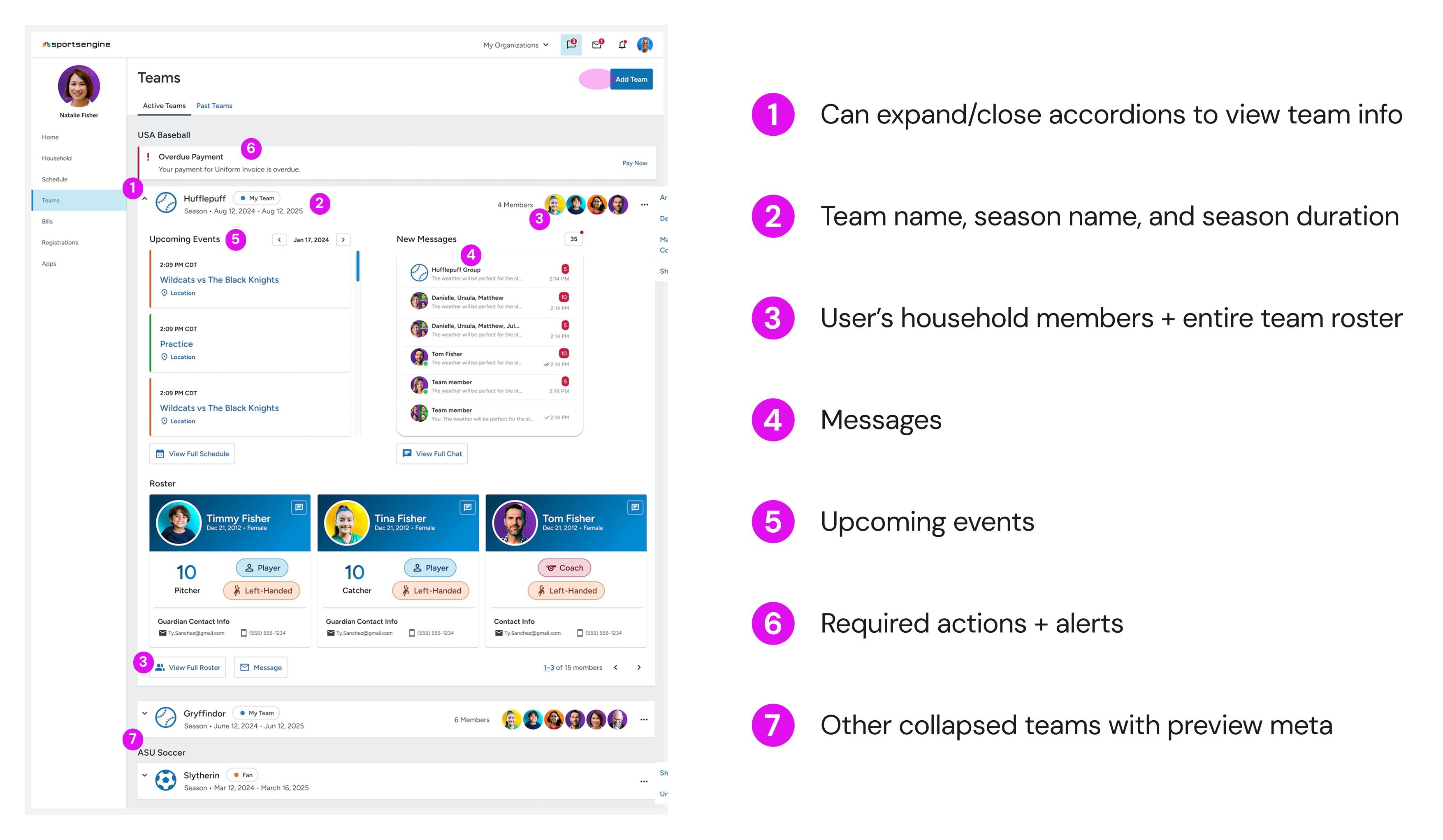
With Team Center out of the way, users could manage all team info directly through an expandable dashboard experience within MYSE Teams. At this stage, I also saw a sharp reduction in clicks paths, which validated this direction.

Prioritize visual structure
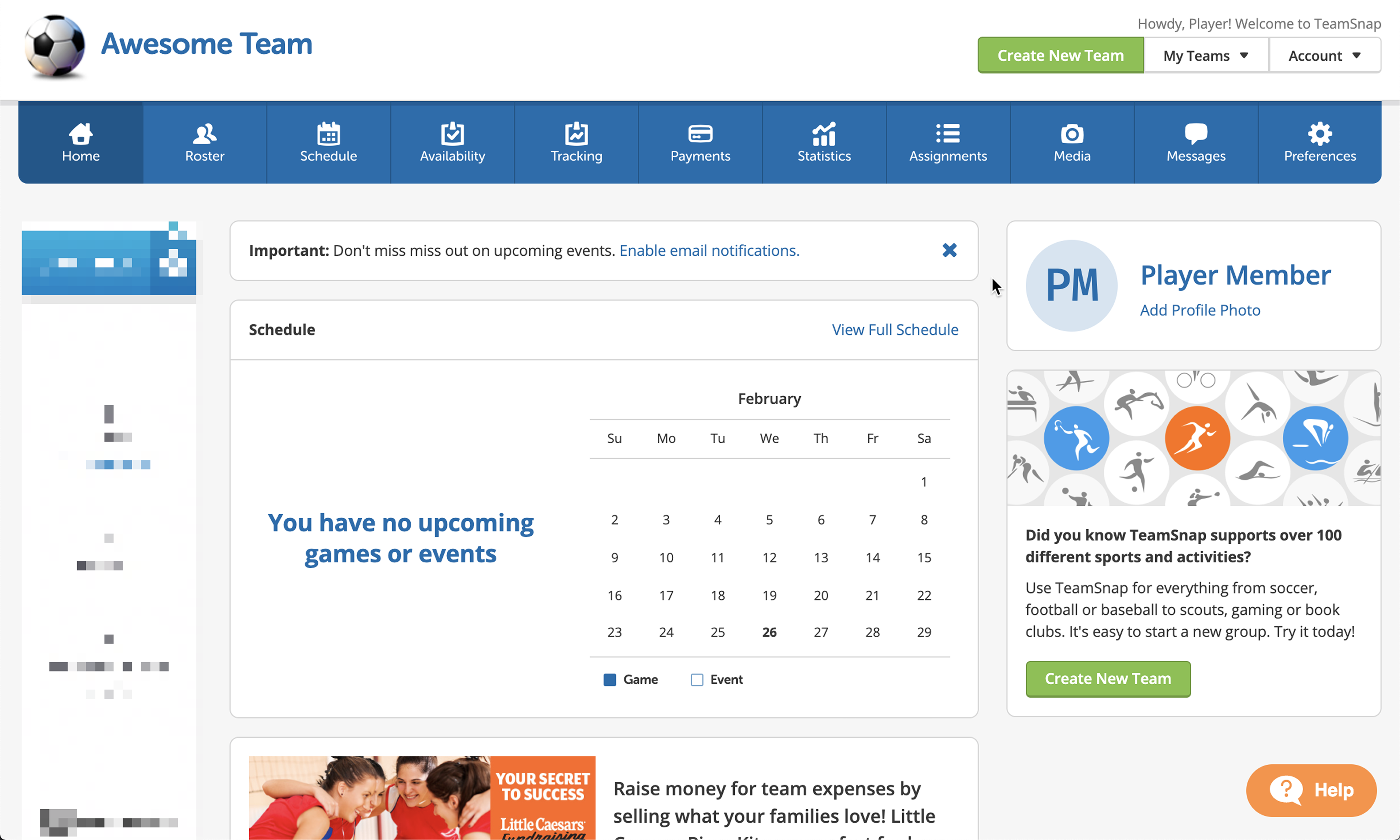
A clearer layout and stronger visual hierarchy would help communicate all that Teams has to offer — as opposed to bare Teams page.

Focus the redesign around key tasks
Planned the next phase of design around key user actions: checking schedules, communicating w/ team, and managing households — all surfaced more clearly and accessibly.
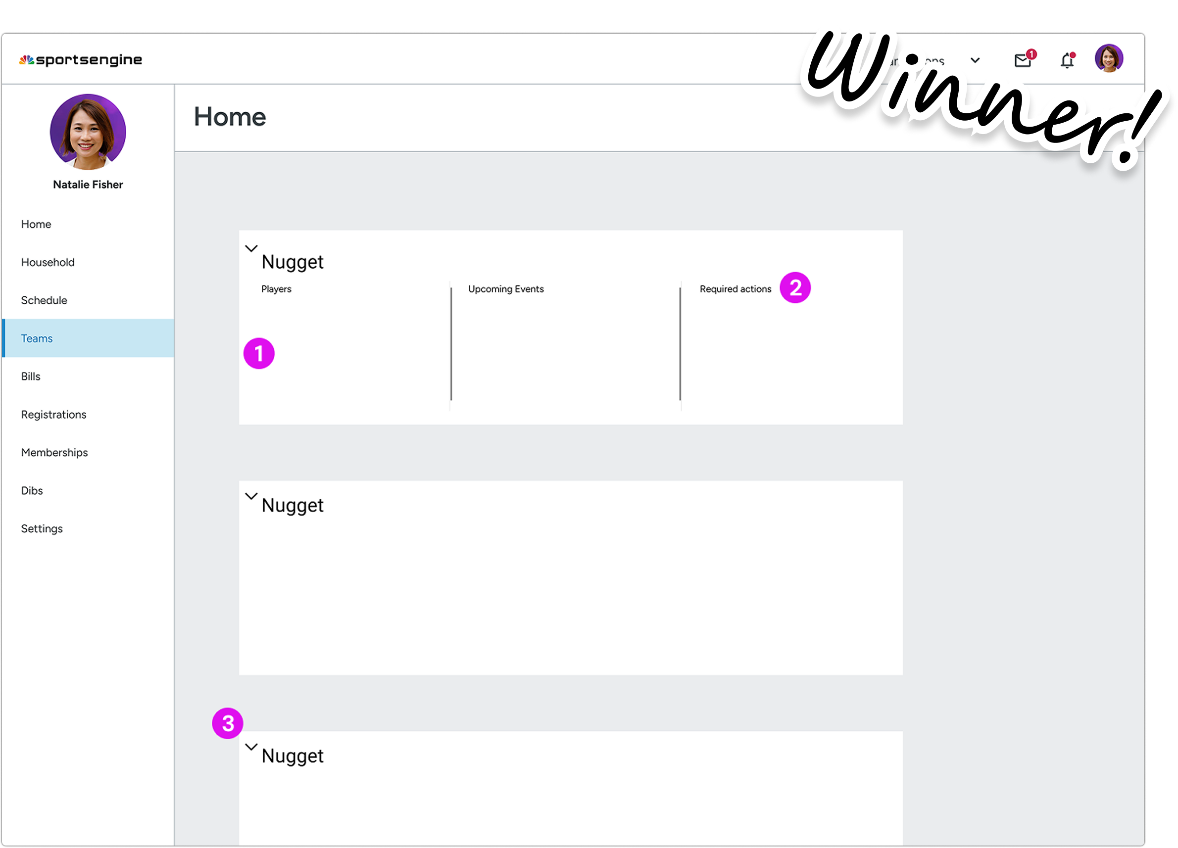
Two days before my internship ended, senior designer Chris expressed important concerns that the ”accordion layout isn't quite working for a dashboard but are close to what a team page could be.”
I had less than 48 hours to figure out an alternative solution
While anticipating a workshop meeting with Chris, I ran a deeper analysis to understand the issue.
Feature density
How much information is packed into a single view.
Efficiency
How fast but more so how easy is it for a parent to find info.
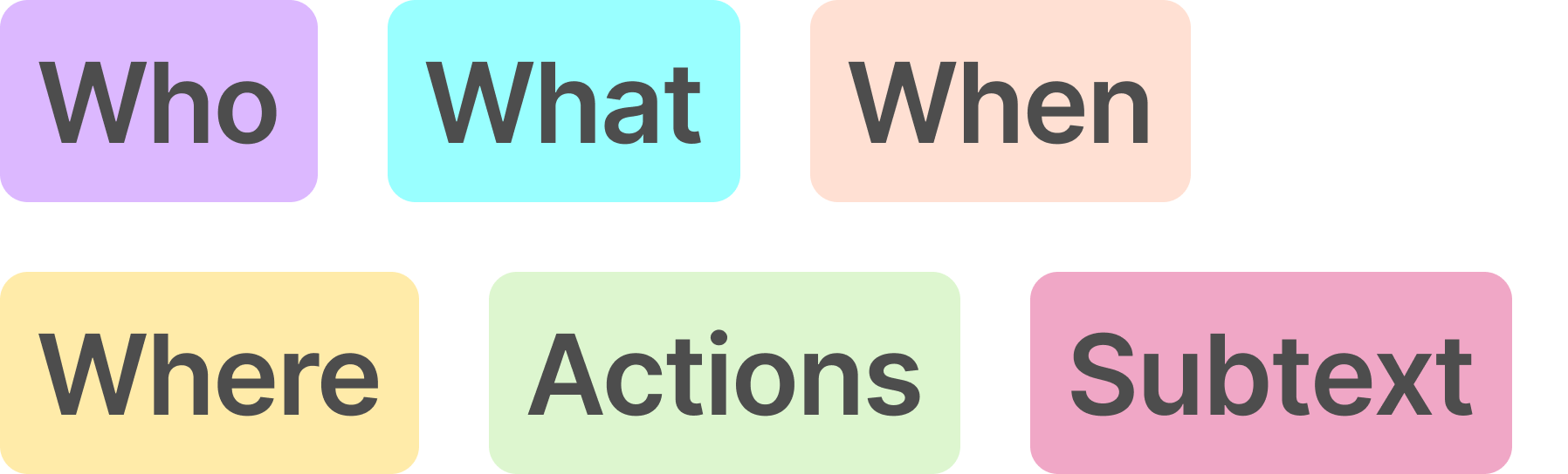
If we map the context below to see where users have to look to find information, we can see how cluttered & difficult it feels to parse this all in one place.
Who (team members, roles)
What (messages, events, tasks)
When (dates, schedules)
Where (locations, assignments)
Actions (buttons, controls)
Subtext (extra details/context)

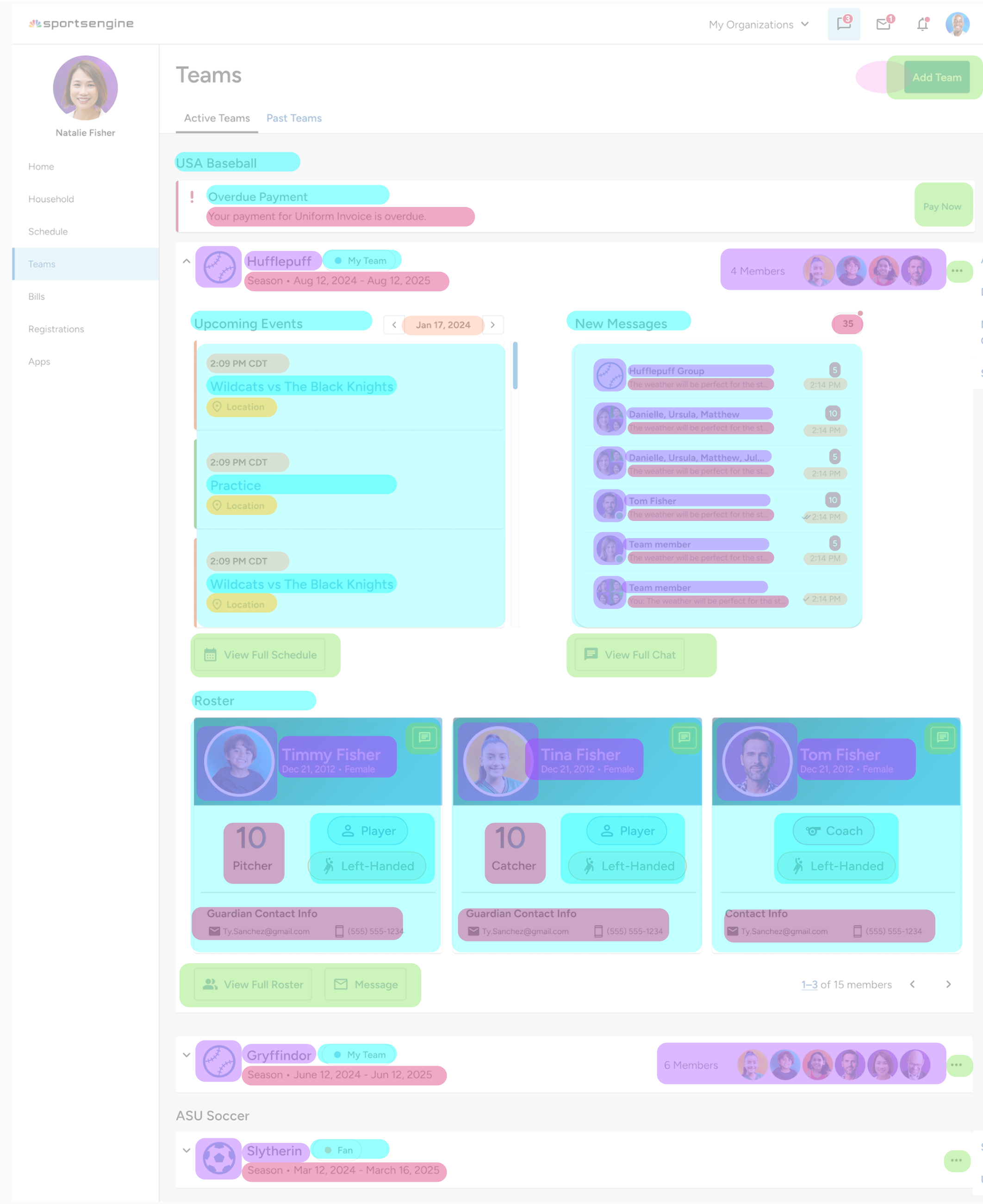
Feature density — High
A lot of information is packed into a single view. Feels heavy without any visual breaks.
Efficiency: Information is not easy to parse
No uniformity > poor scanning and cognitive overload. Multiple things competing for attention + more collapsable teams at the bottom.

Feels clean/simple
Cluttered/squished with accordion functionality > poor scalability. Teams and team info buried on mobile > excessive scrolling.
Second-to-last iteration (accordion dashboards)
Chris agreed that with the extensive content per team, more breathing room was necessary. The accordions were too crammy.
Brainstorming a more modular dashboard layout:
Inspiration
User flow of navigating from old MYSE to Team Center
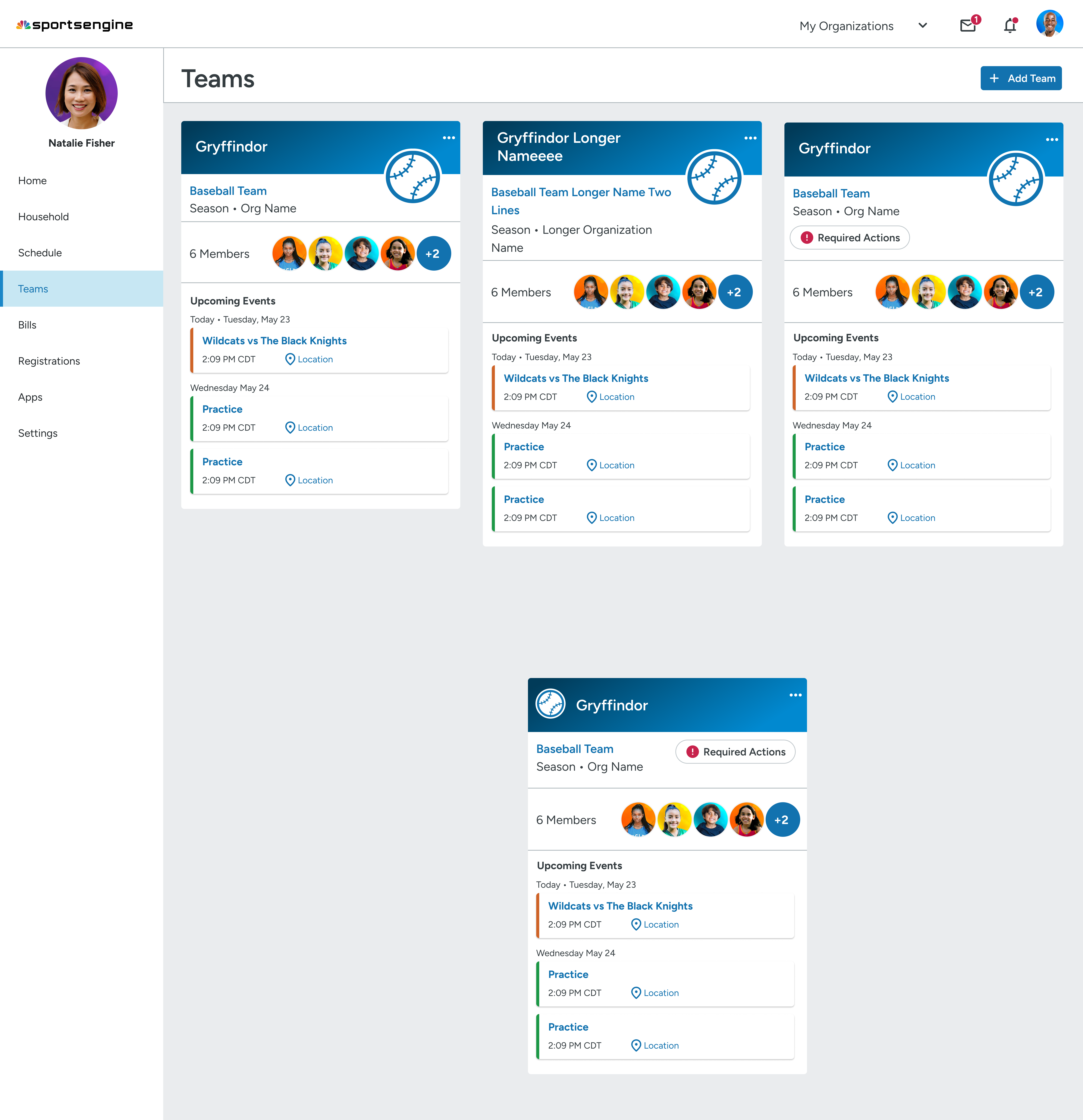
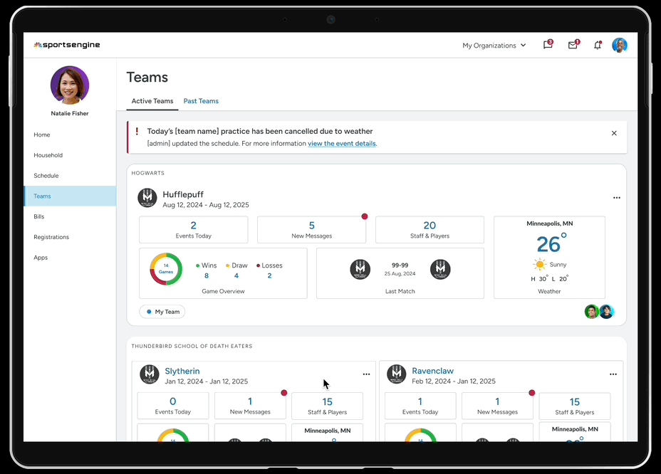
This analysis + chris' feedback informed my pivot to a more modular/bento dashboard layout.
Prioritized clean information summaries upfront (unread messages, match results) in form of widgets.
Validated feasibility for engineers by working with Chris and utilizing existing layout patterns that already existed in the design system > introduced uniformity.
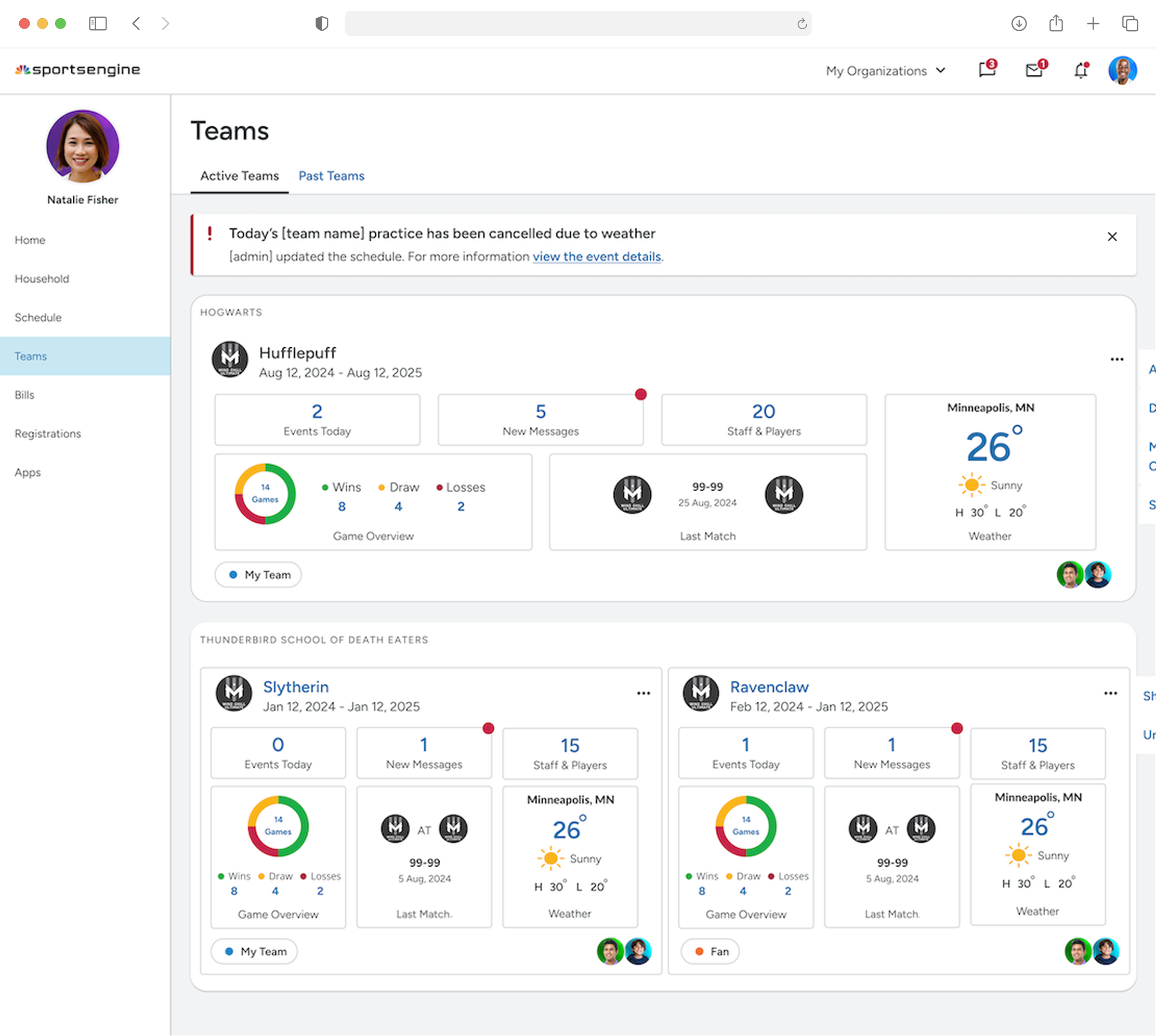
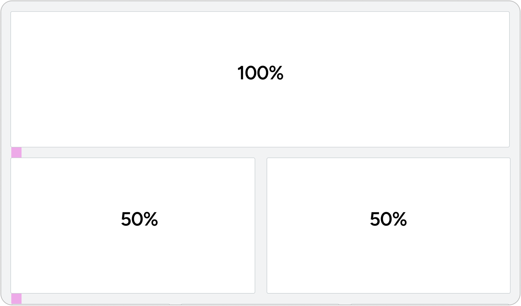
Validating final design: simplifying the dashboard structure to reduce cognitive load.
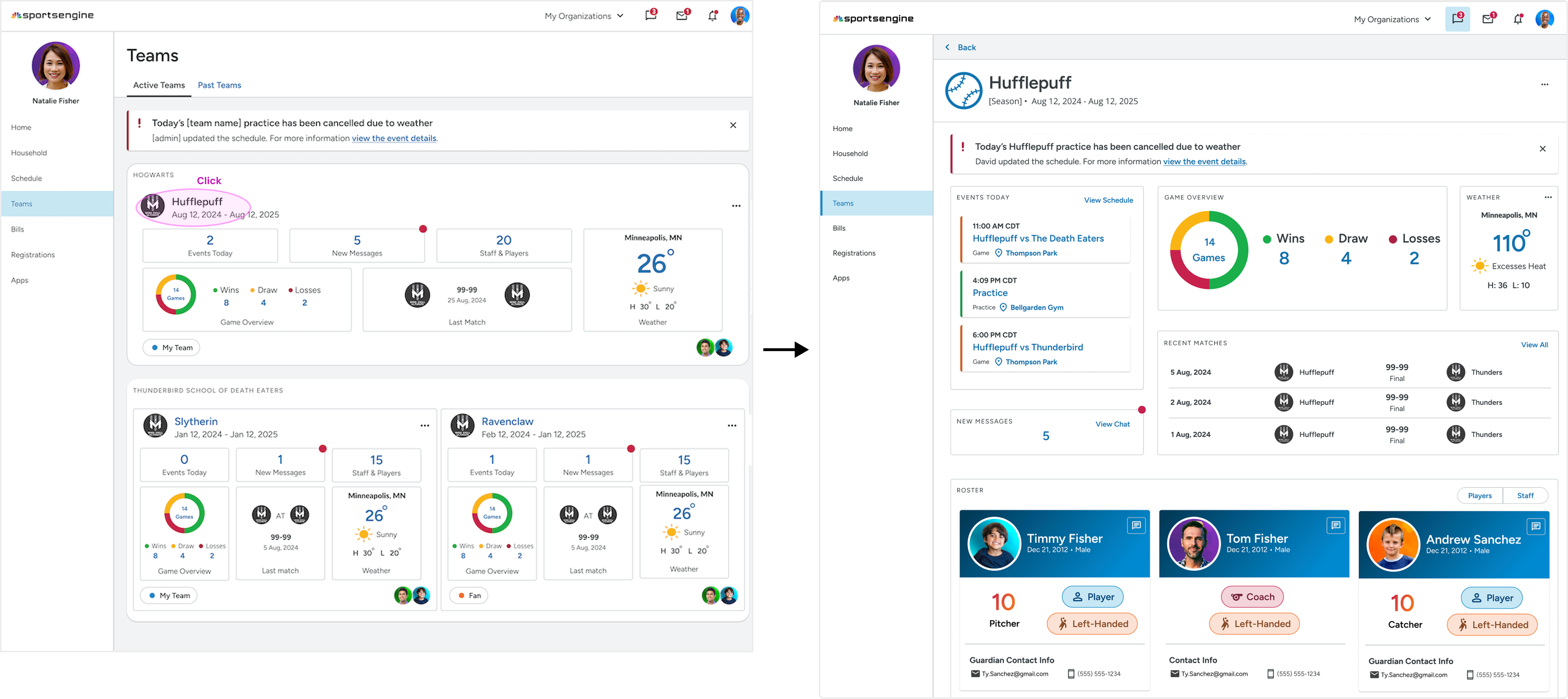
Splitting Teams into 2 screens: Team Dashboards (concise overview) + Team Details (in-depth view).

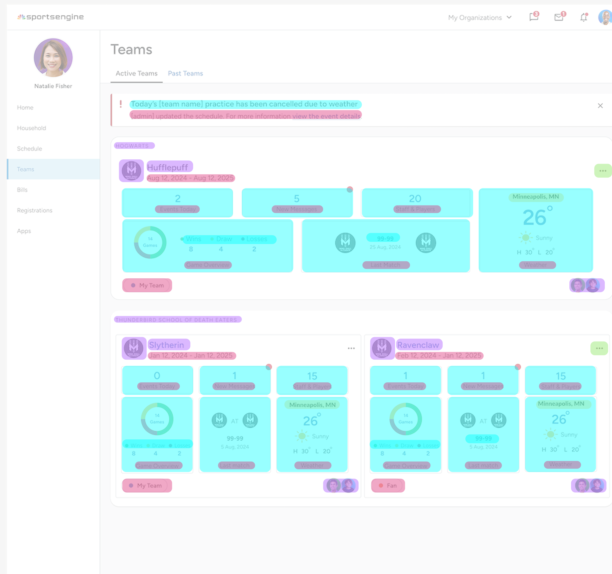
Feature density — Low
Info is more spread out — divided bt/w 2 screens.
Efficiency: Information is easy to parse
According to entire design team, easier to scan and jump to the right team/section faster bc of uniformity.
Feels clean/simple
Key actions r visible without overwhelming that first view. Modular design also makes it easier for devs to maintain.
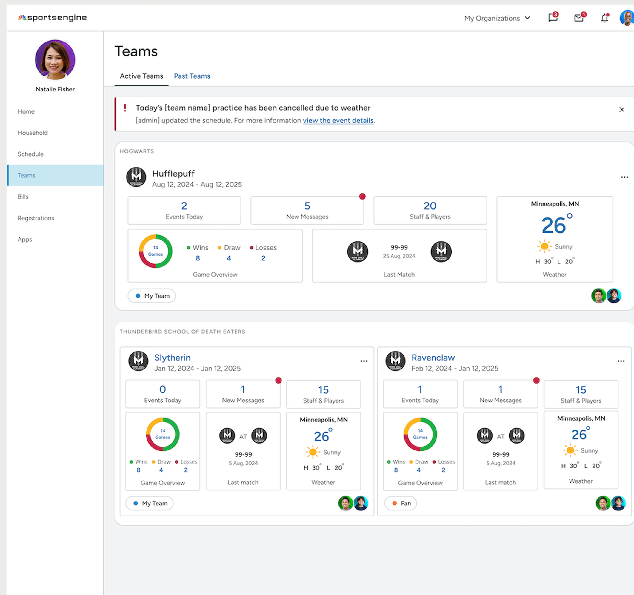
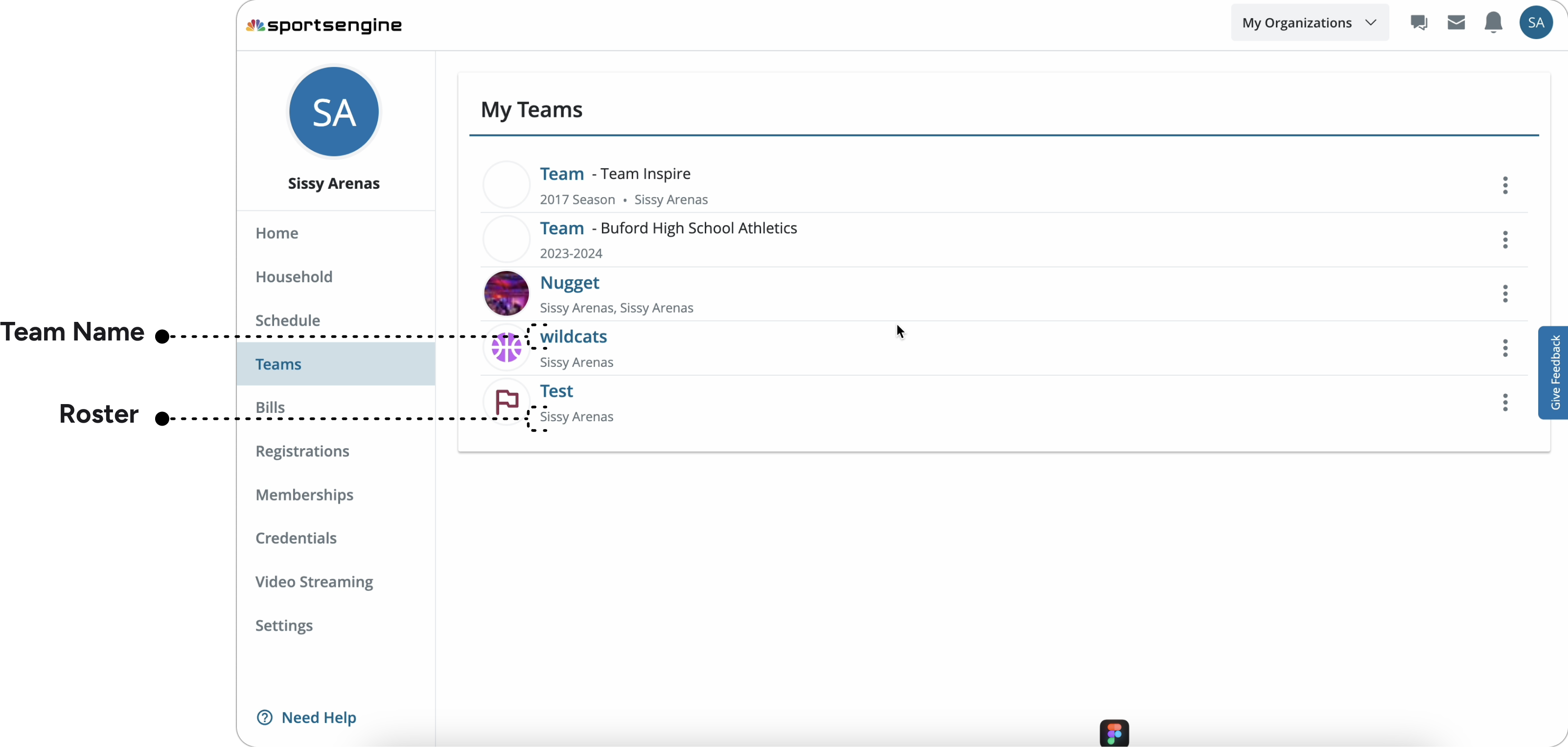
Teams Page
Feature density — Low
Info is more spread out — divided bt/w 2 screens.
Efficiency: Information is easy to parse
According to entire design team, easier to scan and jump to the right team/section faster bc of uniformity.
Feels clean/simple
Key actions r visible without overwhelming that first view. Modular design also makes it easier for devs to maintain.
Teams Page
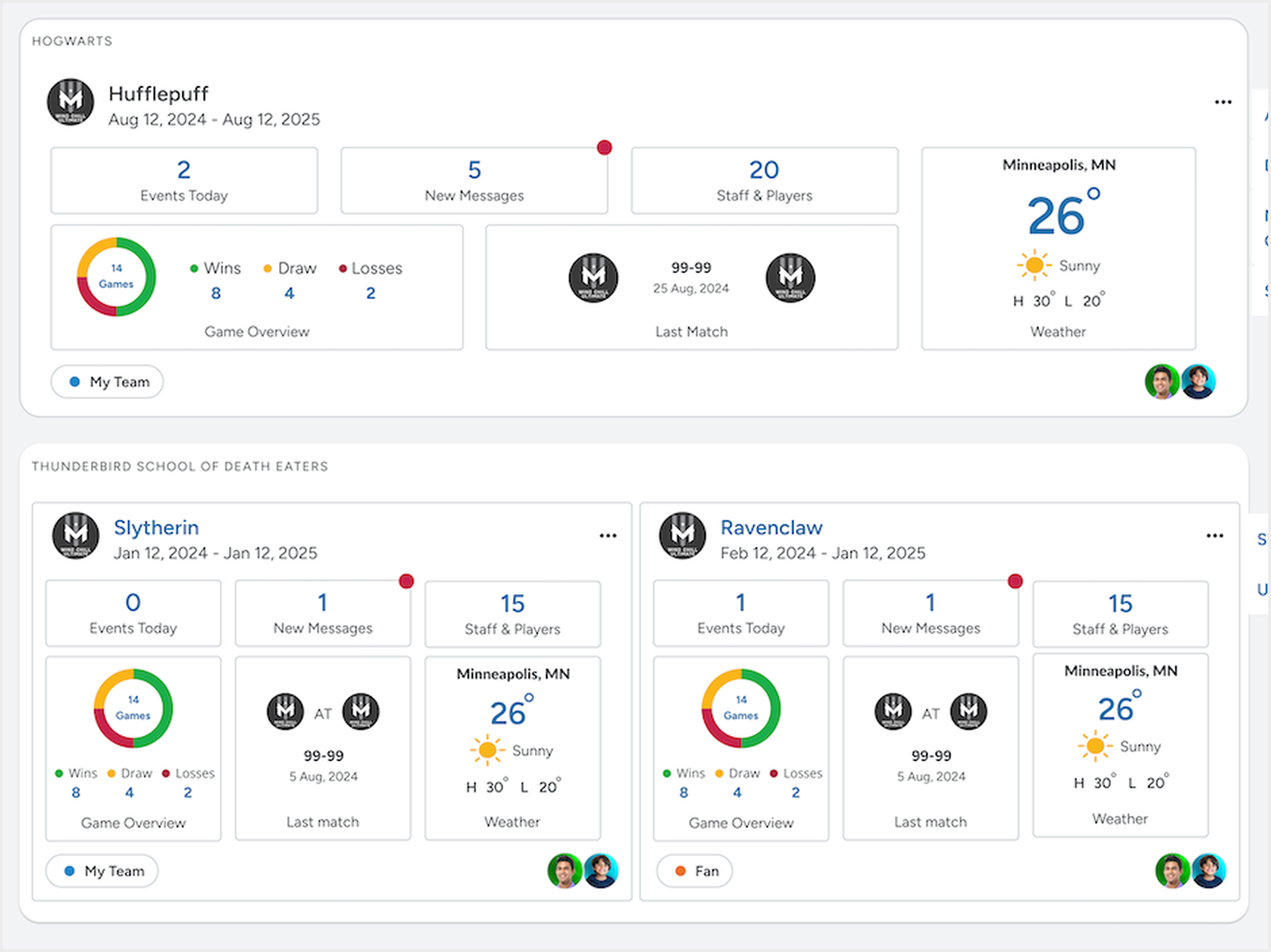
4. Enhancing engagement — final modular design
Designed quick-access widgets (chat, alerts, wins) to maintain user motivation and reduce task friction.
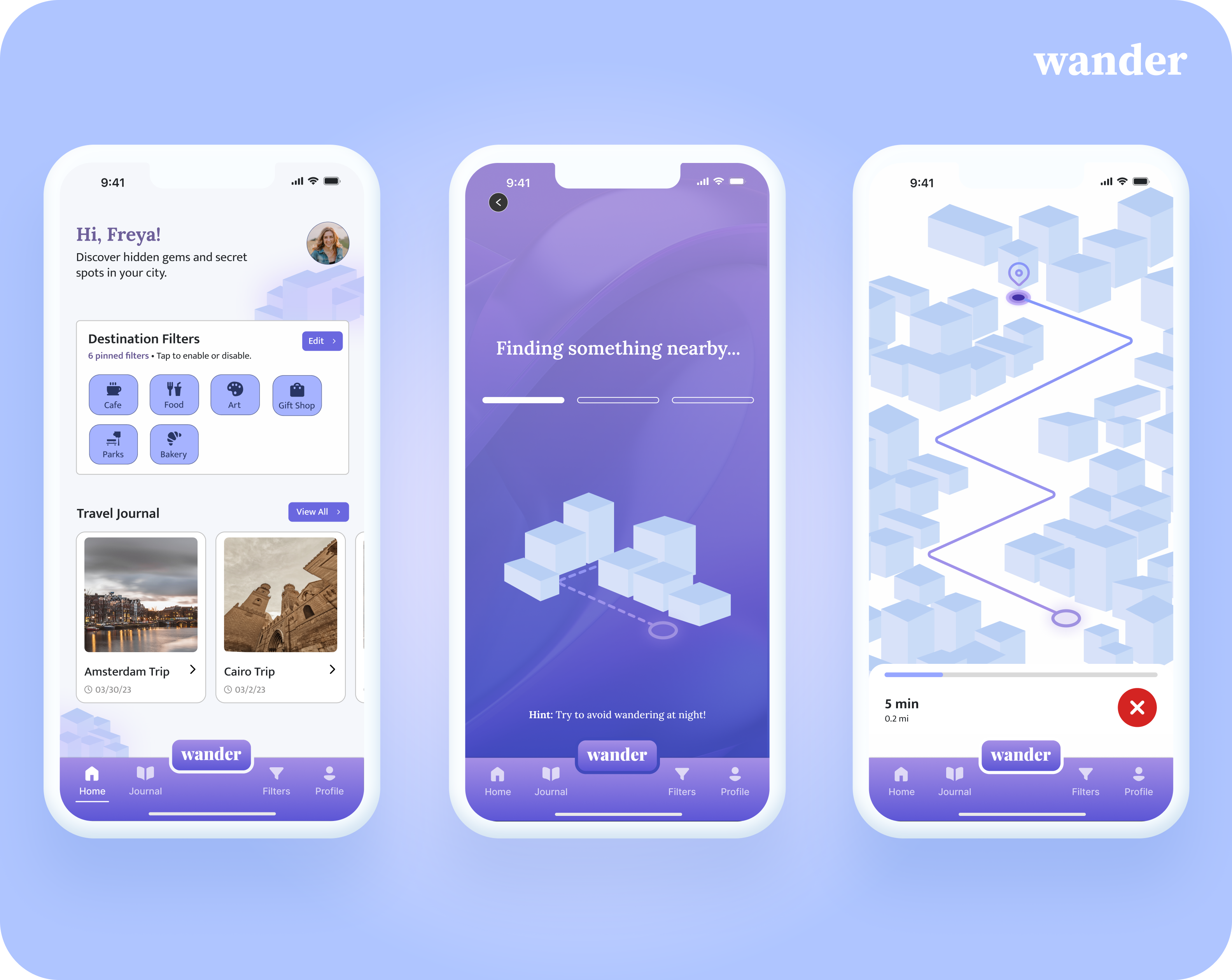
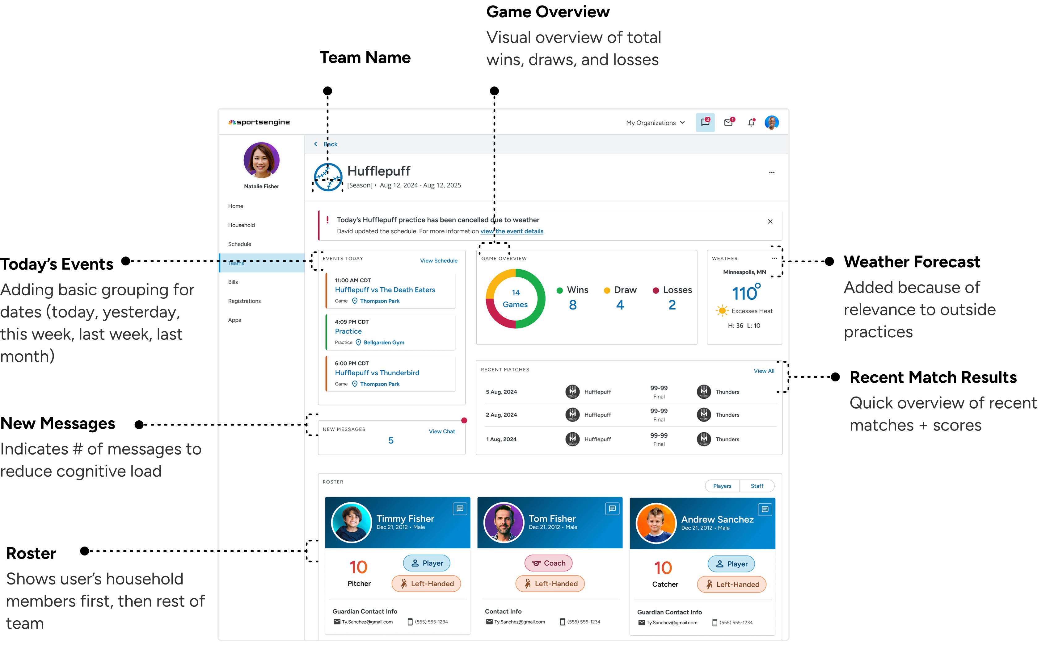
Team Dashboards page:
User flow from old MYSE to Team Center
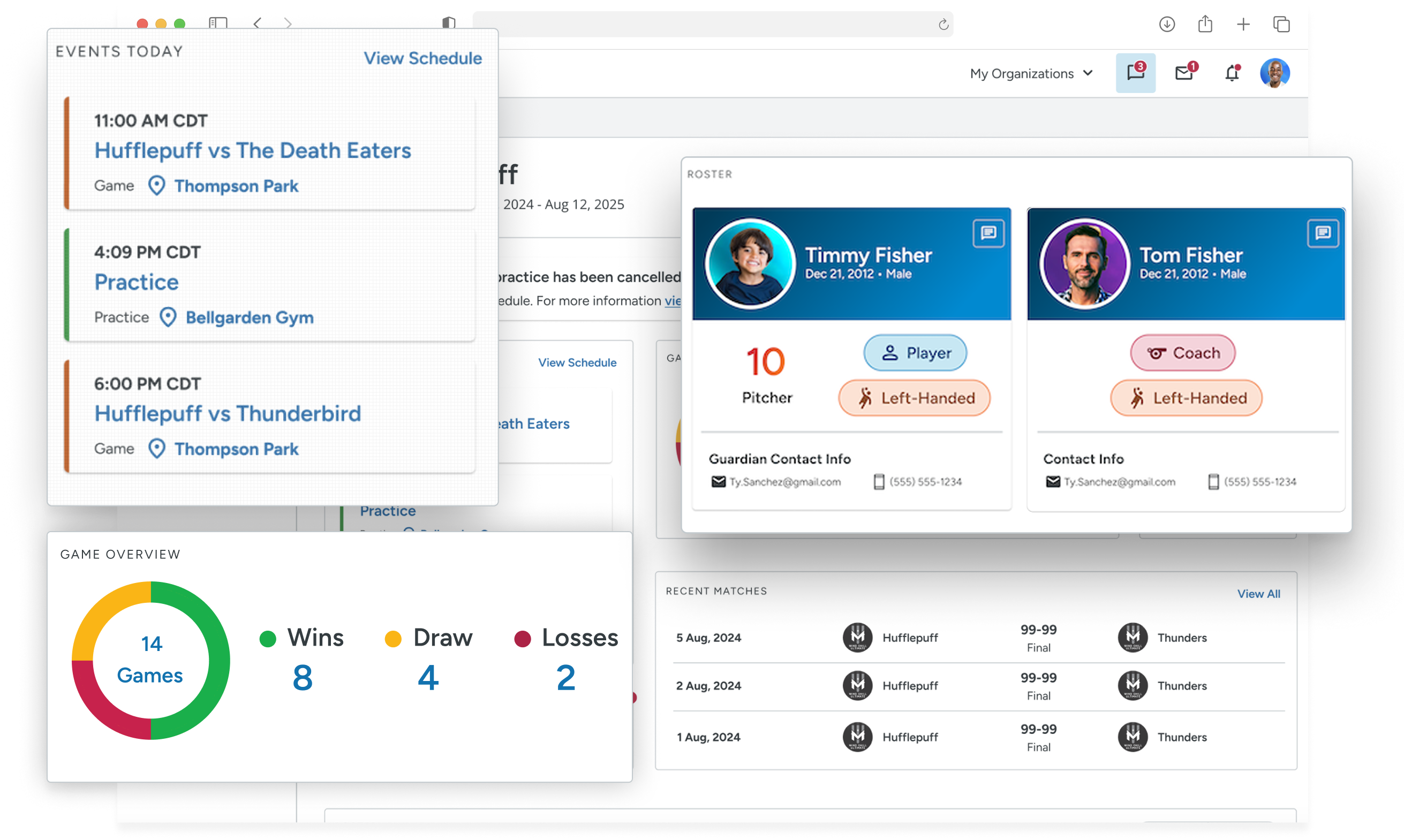
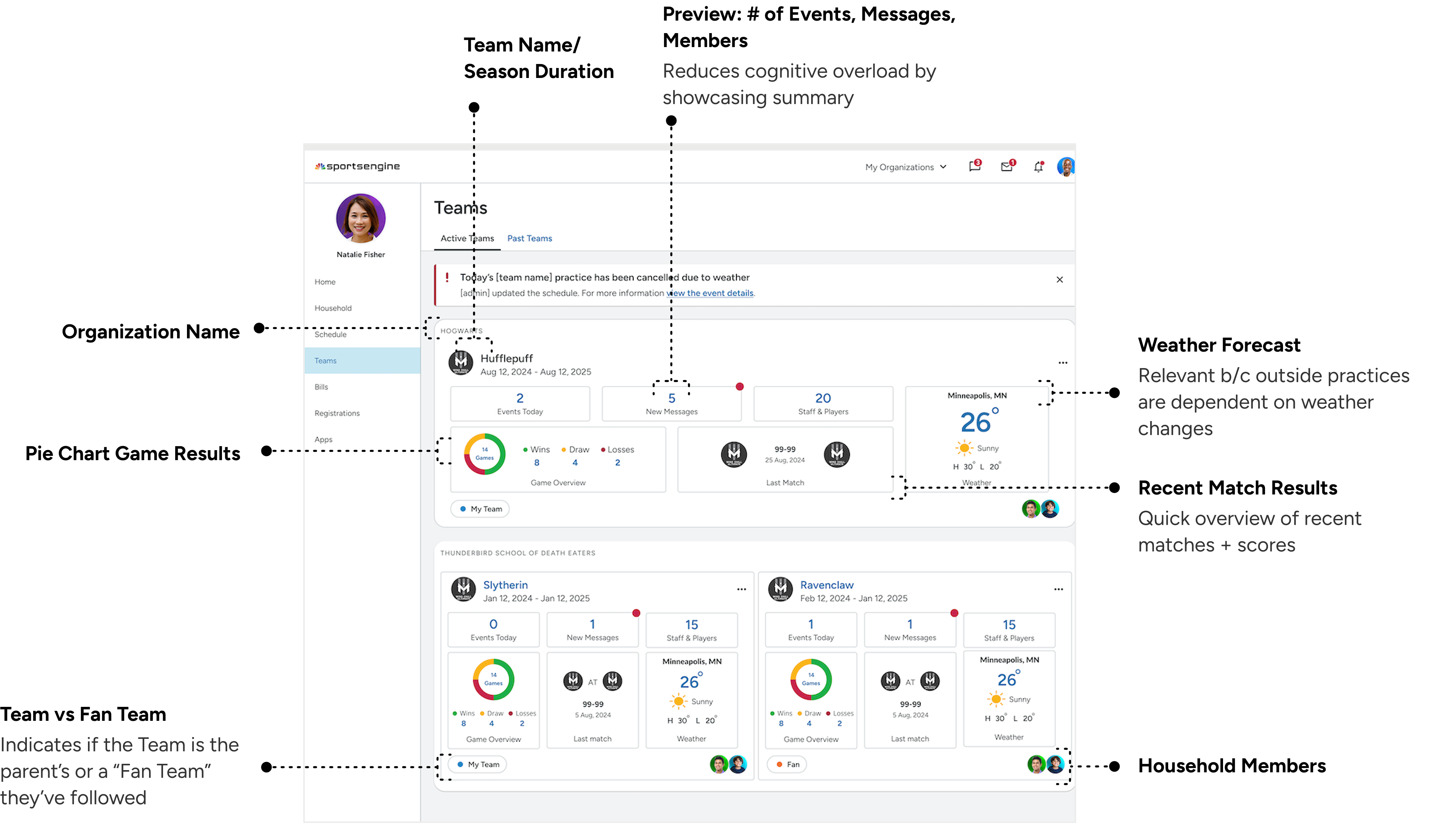
Quick-access widgets for (# of events,, # of unread messages, roster).
Some widgets are interactive, allowing users to dive into more info quickly (e.g. clicking new messages opens up a full page panel of that team’s chat.
Lightweight summaries reduce cognitive load up front when users scan all teams.
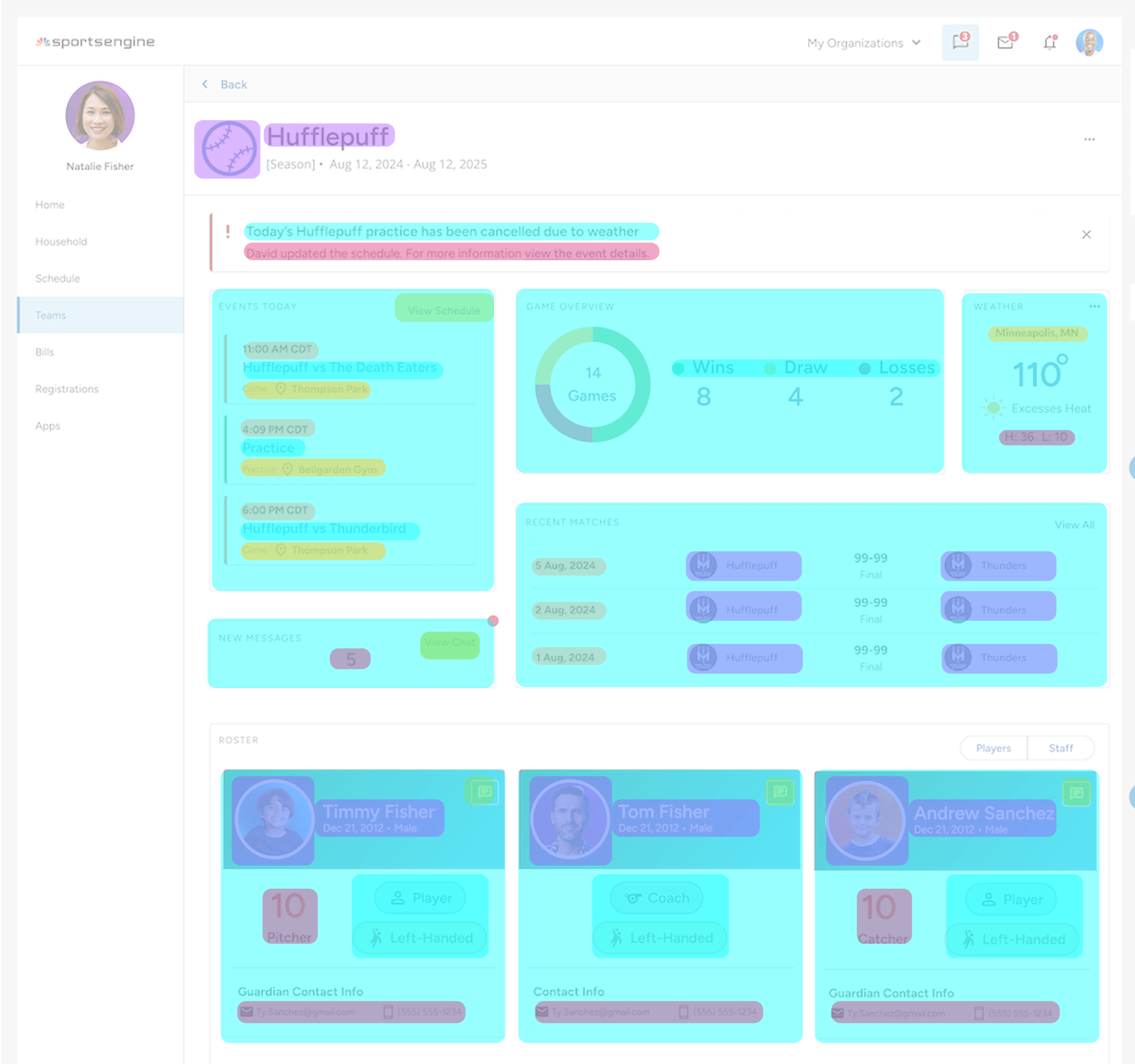
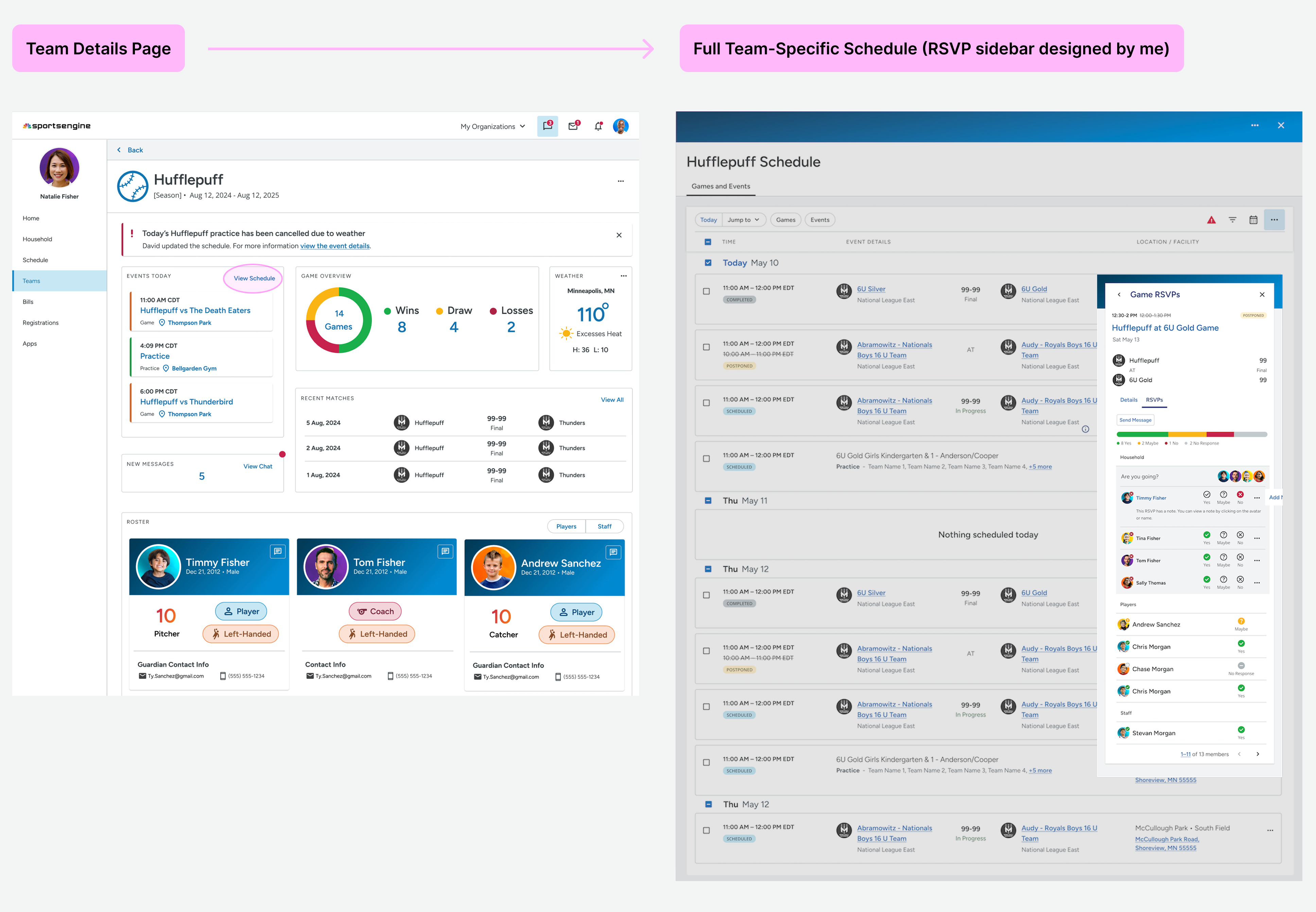
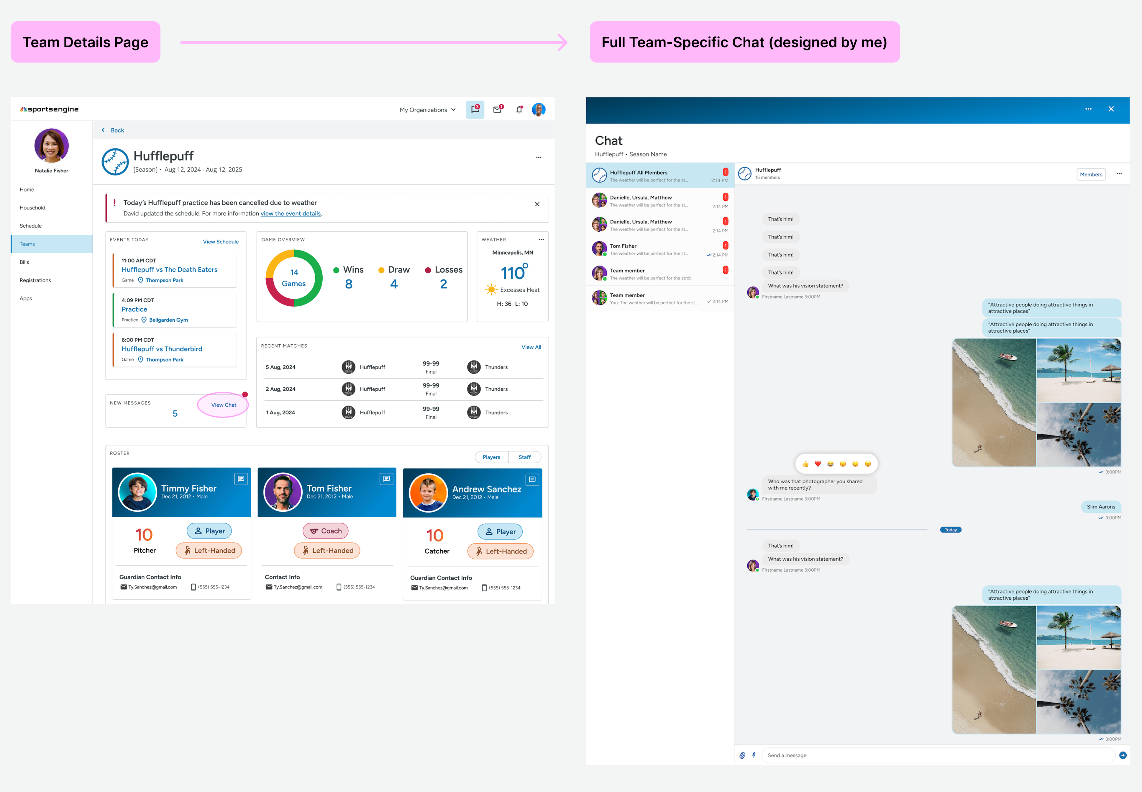
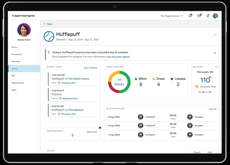
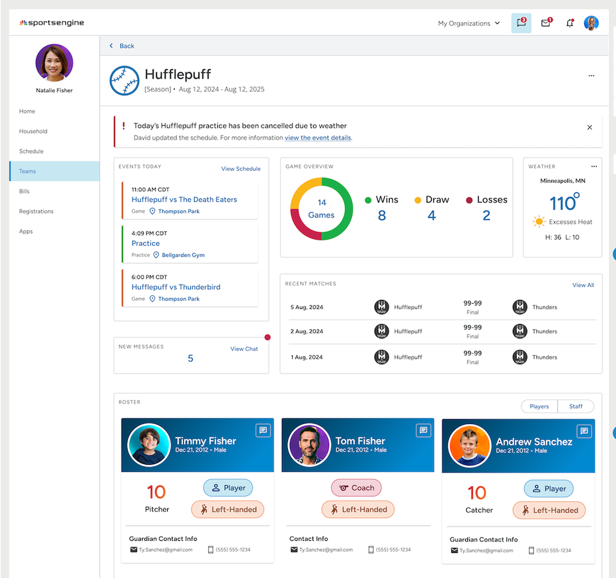
Team Details page:
Left messages as a # count to reduce load; messages aren't interactive on this page either.
Recent games + game overview widgets fun addition. Relevant for parents invested in team activities.
Weather component > poor weather is main reason for cancelling/rescheduling events. Ideally would've tested.
Parents can access key team information in fewer interaction steps compared to the legacy layout
Viewing roster takes:
Old Design — 2 clicks
Now Design — 1 click
Schedule:
Old — 2-4 clicks
New — 1-2 clicks (progressive disclosure)
Chat:
Old — 2-4 clicks
New — 1-2 clicks (progressive disclosure)
Previously, teams were sorted oldest-to-newest — frustrating parents that managed multiple active teams
I defined logic for team–organization sorting in Teams page — active vs past teams, and prioritization of “fan teams”
On average, an account owner will have about 5 teams and 1.5 organizations.
New Structure:
Team logic
Active teams and past teams were separated into tabs
Organizations were sorted alphabetically, but overridden by recency when a new team was registered
"Fan teams" (teams you're just following) are deprioritized compared to the user's own teams
Feedback from Team
Recent match results and a pie chart game overview is a fun addition that makes dashboards more dynamic and engaging.
By using numbers to summarize events, messages, and members, the interface remained clean and simple, preventing information overload.
“I love that we're giving the user more info upfront and more delighters. I really like the stats and standings you added to the team cards, great idea!”
“I think you team page could actually take over as a new home page.”
Full Interaction Design
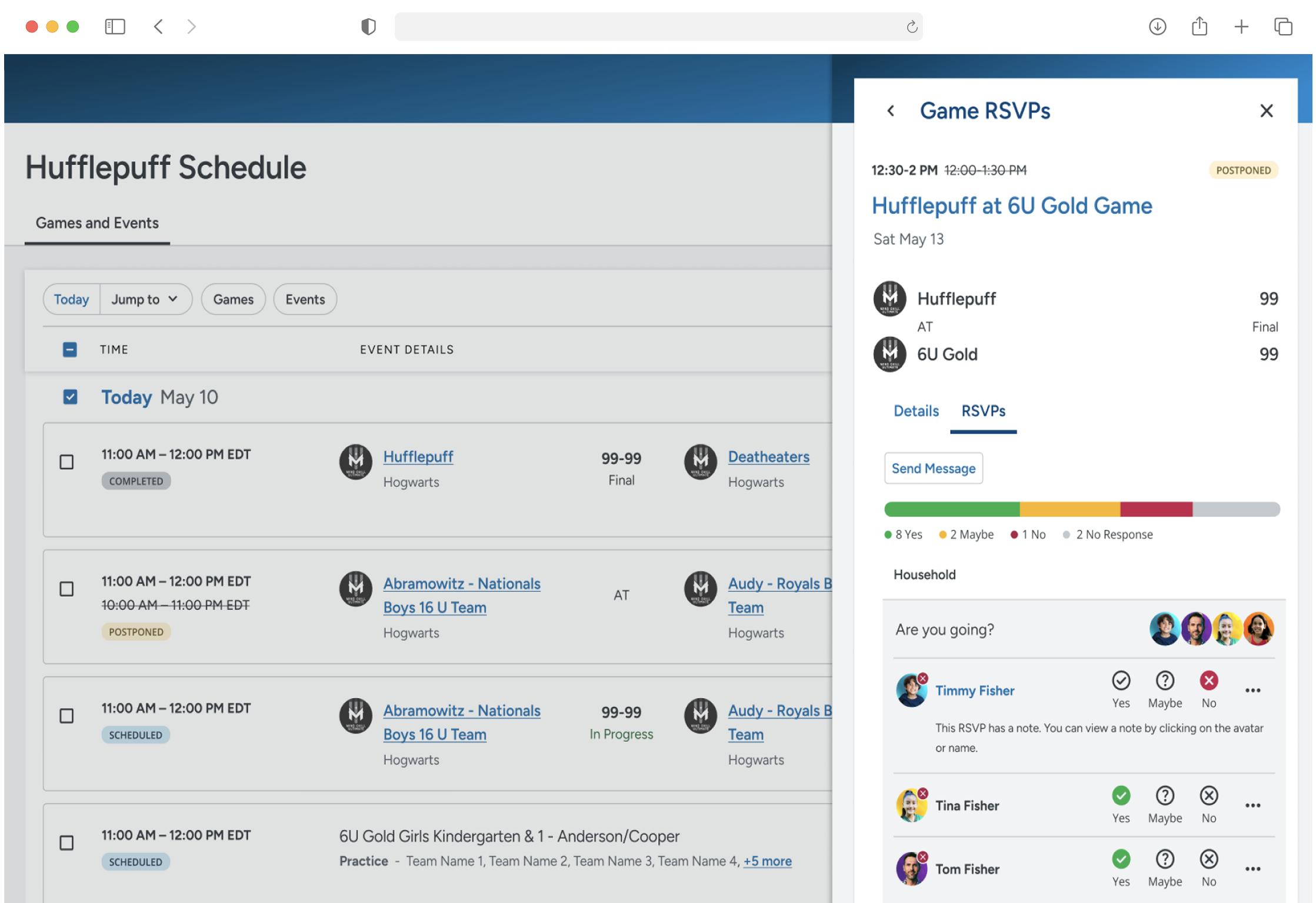
The blue text links out to the full page panels that displays a comprehensive view of both the team schedule and chat.