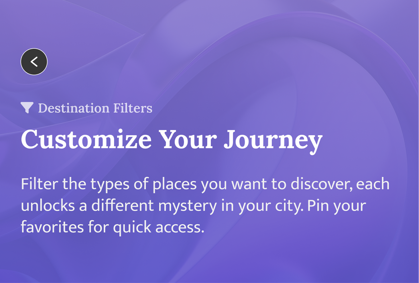
menu_open
Open Menu
Wander — to feel immersed in a destination and bring adventure back into travel
Project Summary

For a UX Design semester-long course at the University of Southern California, I designed a mobile app that leads travelers to unique local spots — revealing each destination only after they arrive — to deliver a spontaneous but tailored travel experience that fosters deeper immersion in their destination.

Role
Product Designer
Time
12 weeks
TOOLS
Figma
Qualtrics
Platform
Mobile

Project Type

Completed at USC in a Designing for User Experience course. The product idea originated from Luc, a member in my group. All of us actively contributed to researching the problem space, and shaping the app's purpose & development.

If you're a frequent traveler, you might experience lack of spontaneity, lack of immersion, and limited exploration.

Issues Arise At Touristy Spots...

In 2019, an academic study analyzed 140,712 TripAdvisor reviews from Paris' top attractions, which identified 6 key factors that shaped tourists’ travel satisfaction:

  • Staff and Service

  • Wait Times

  • Safety and Security

  • Facility Upkeep

  • Time Value of Money

  • Visitor Expectation

Negative reviews revealed that overtourism at popular destinations directly impacted these satisfaction factors (i.e. high theft, long waiting times, occupied spaces), showing a clear opportunity to design alternatives for travelers seeking more meaningful experiences.

Problem

Overtourism at popular destinations creates logistical frustrations and reduces authenticity, which leaves travelers feeling unfulfilled, less immersed and less likely to return.

How might we...

Help travelers break free from overtouristed attractions and discover spontaneous, immersive experiences that bring joy back into travel?

Preview

Tailoring your adventure

  • Apply filters to customize the type of locations Wander reccomends.

  • Pin most used filters to home screen to easily enable/disable.

Click the Wander button & explore

  • Click the Wander button to generate a route to a mysterious location that will reveal itself once traveler arrives.

  • Empowers travelers to explore local sites and immerse themselves.

Capture and share hidden gems

  • Store and organize their favorite destination with folders.

  • Share folders with friends.

Try it out yourself!
My Role and Responsibilities
From concept to quest — The (hero's) design journey

Competitive analysis — little to no competition

There was little to no competition for what we were trying to build. There are apps that help users navigate a location they've never gone to before. Besides their ability to add some personalization, none of them have features that we envisioned for Wander.

Unearthing unmet traveler needs

To ensure Wander served a wide spectrum of travelers, we designed for extremes. By choosing two contrasting personas, we could also uncover edge cases and stress-test our design decisions against very different needs and behaviors.

Freya the spontaneous traveler

Freya is a user who:

  • Thrives on surprise and discovery.

  • Rarely plans ahead.

  • Looks for unique, shareable moments off the beaten path.

Sam the overprepared traveler

Sam is a user who:

  • Normally thrives on control and detailed planning.

  • Also feels the stress of rigid itineraries.

  • Craves safe ways to be more spontaneous without losing peace of mind.

Mapping Wander’s vision

User story map

Together, we brainstormed key features for Wander. I wanted to design a travel diary for users like Freya who value recording things and sharing on social media. I also recognized that users would benefit from some level of customization, particularly with choosing location types to personalize user's experience.

3 core pillars of Wander’s magic

Finding uncommon places to visit
Personalization: Setting location preferences
Storing memories

Planned a Travel Mode feature for anxious travelers

The Travel Mode feature was intended to provide users that have overplanning tendencies with a little more structure in the beginning, allowing them to feel like they have a little more control over where they were going.

In Travel Mode:

  1. The user specifies their desired end destination

  2. While they're en route, the app sends them notifications about a nearby spot (concealed) they can choose to explore.

Planned a Wander Mode feature for spontaneous travelers

Wander Mode catered to users that want to be spontaneous.

In Wander Mode:

  1. Users initiate Wander mode.

  2. Go about their day.

  3. App triggers a notification to explore a local spot when they're on the move.

These two modes were to be the main features of Wander.

4 major improvements to Wander after feedback

1. Removed Travel Mode: We were solving for a problem that didn't exist

I began to doubt Travel Mode's alignment with the app's overarching objectives. We recognized the conflicting nature of having both Wander Mode (which promotes spontaneity and discovery) and Travel Mode (which caters to more planning-oriented users). We had strayed from the original issues we unearthed about travelers.

Interviewing shows us that people wanted inspiration not reassurance

After interviewing, 30+ people, they shared that they have used a navigation app to go somewhere new, despite the fact that most of them were not spontaneous travelers. This feedback helped us realize that people have less of a need for reassurance and more of a need for inspiration, which is what our app’s main aim was.

Key Insights:

  • Travel Mode meant to help more anxious travelers feel comfortable.

  • Users have less of a need for reassurance and more of a need for inspiration.

  • Having both Travel and Wander Modes was contradictory to the app’s purpose.

We discarded Travel Mode and pivoted towards providing inspiration through Wander Mode.

2. Refined Wander Mode

Key Insights:

  • Wander Mode was originally designed to make anonymous suggestions throughout the day.

  • Arbitrary notifications might disrupt daily activities and annoy users.

  • Give users more autonomy over when they want to explore: press Wander button and begins journey.

3. Redesigned Home to convey Wander's purpose and unique value

The appeal of Wander was that it provides a unique service for travelers, but I felt the original Home Screen felt too "Uber-like" and was concerned users would mistakenly think this was purely a navigation app.

User interviews showed that Wander reminded people of existing map apps

User research with our initial wireframes revealed that for users, Wander felt reminiscent of existing navigation applications such as Google Maps and Waze.

Key Insights:

  • Designed Home to visually communicate what the app is for and display its key features — as opposed to a map.

  • Wander maintains product differentiation.

4. Removed AR integration during Wander Mode

We wanted to gamify Wander to make traveling more fun for users because this isn't just a navigation app. However, users expressed various concerns so we removed the use of augmented reality.

Removal of AR During Wander Mode

  • Augmented reality feature can drain battery life.

  • Interviews revealed AR made it feel like there were two realities, which doesn't help with immersion.

  • Staring at phone constantly would be too distracting when traveling (we learned enough from PokemonGo).

  • Introduced a travel badge system to engage users — earned by going on adventures.

Designing A New Map

  • We change the map, drawing inspiration from Candy Crush. Instead of displaying the entire surrounding area, we wanted to conceal it, to make it quest-like.

  • We included ETA and distance indicators because user testing informed us that those were essential guidance for users to reach their destination.

Crafting Wander’s visual design

Design system and conveying the hidden, the mysterious, and the unexplored

Screen design

Luc and I created the purple linear gradient that transitions from a soft lavender at the top to a deeper violet at the bottom. This gradient conveys a sense of depth and discovery — much like the ocean, it suggests that there is more hidden beneath the surface, waiting to be explored, directly tying into Wander’s theme of uncovering mysteries and hidden gems.

To add richness, I layered in subtle swirling wave-like patterns within the gradient. These flowing, organic shapes create movement and a sense of the unknown — similar to clouds, fog, or currents in water. They visually symbolize exploration, mystery, and the ever-shifting nature of discovering new places. Rather than a flat background, this effect makes the interface feel immersive and dynamic.

On the home screen, I introduced geometric building motifs with a softened, blurred effect. This not only nods to navigation through the Wander map but also reinforces the idea of a city partially hidden in fog, inviting users to “clear the mist” through exploration.

The white background on the home screen was chosen for accessibility and legibility, since Wander is designed to be used outdoors where sunlight and glare can interfere with readability. The clean white canvas ensures that text and icons remain sharp and easy to see.

Color Palette

Purple represents exploration and mystery. It has long been linked to the realm of intrigue, and evokes a sense of depth and allure. Purple helped to create a captivating visual identity for Wander that aligns with the exploratory nature of the app.

Typography

We used Major Third as a scalar for all of our fonts starting with Paragraph as the base case. To reduce eye-strain, Wander uses #212427 or “Old Print” to reduce the level of contrast between the white backgrounds and our darkest colors. Finally, we used Display sparingly! It is meant for large impact labels.

Preferences

  • Filter the types of destinations that Wander will generate. The location isn't revealed until the end, but this provides a level of personalization, ensuring that the recommended destinations align with the users' interests.

  • Pin most frequent filters to their home page. This enhances user convenience because users can conveniently enable or disable their preferred filters with ease and without having to navigate to different screens.
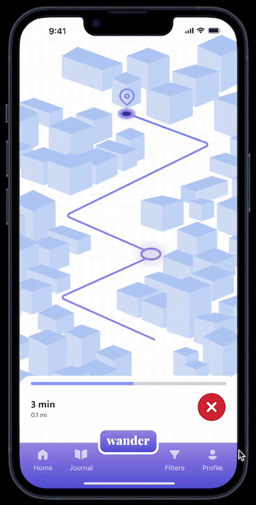
Wander Mode

  • Map guides the user to the destination, with a current location indicator. The design incorporates gamification elements, making it quest-like and creating suspense/excitement by keeping the surrounding area on the map unrevealed.

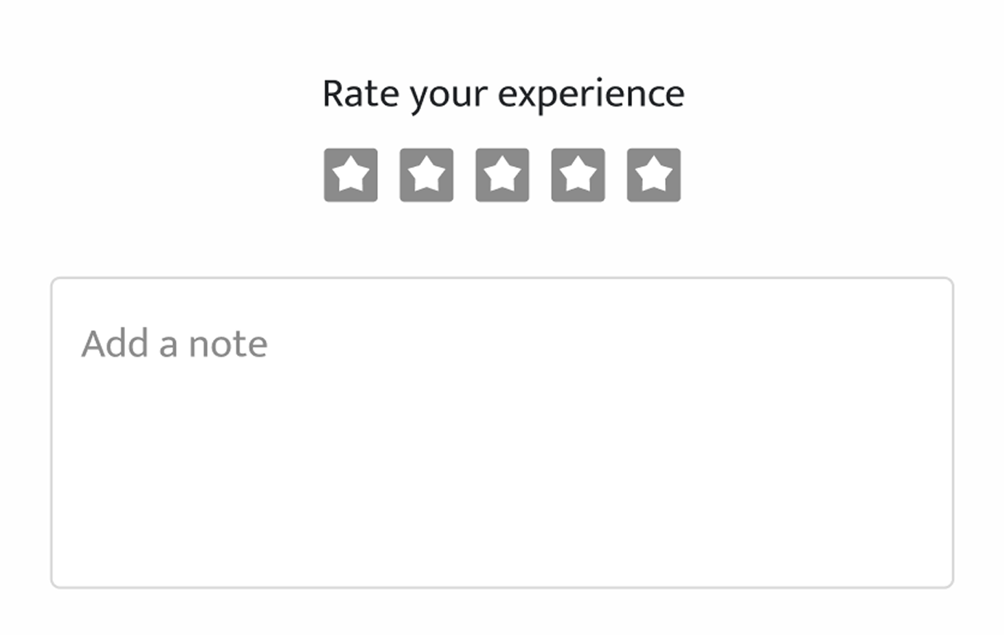
  • Picture of their destination will trigger upon reaching it. They can then rate it, write a note, and add it to their travel journal.

Travel Journal

  • Record their trips within Travel Journal. Users can create journals to organize different Wander destinations.

  • Users can view destinations they visited in the caroursel, as well as add photos from that spot. Users can also share their trips with friends, both within and outside of the app.

  • Users can also share their trips with friends, both within and outside of the app.

Additional App Feature

Troubleshooting

  • Users can easily exit a Wander quest.

  • They'll be prompted to provide a reason for leaving > be directed to the filters widget where they can make changes.

  • Promotes user satisfaction and enables user research so the app can enhance its features to better cater to users' needs.
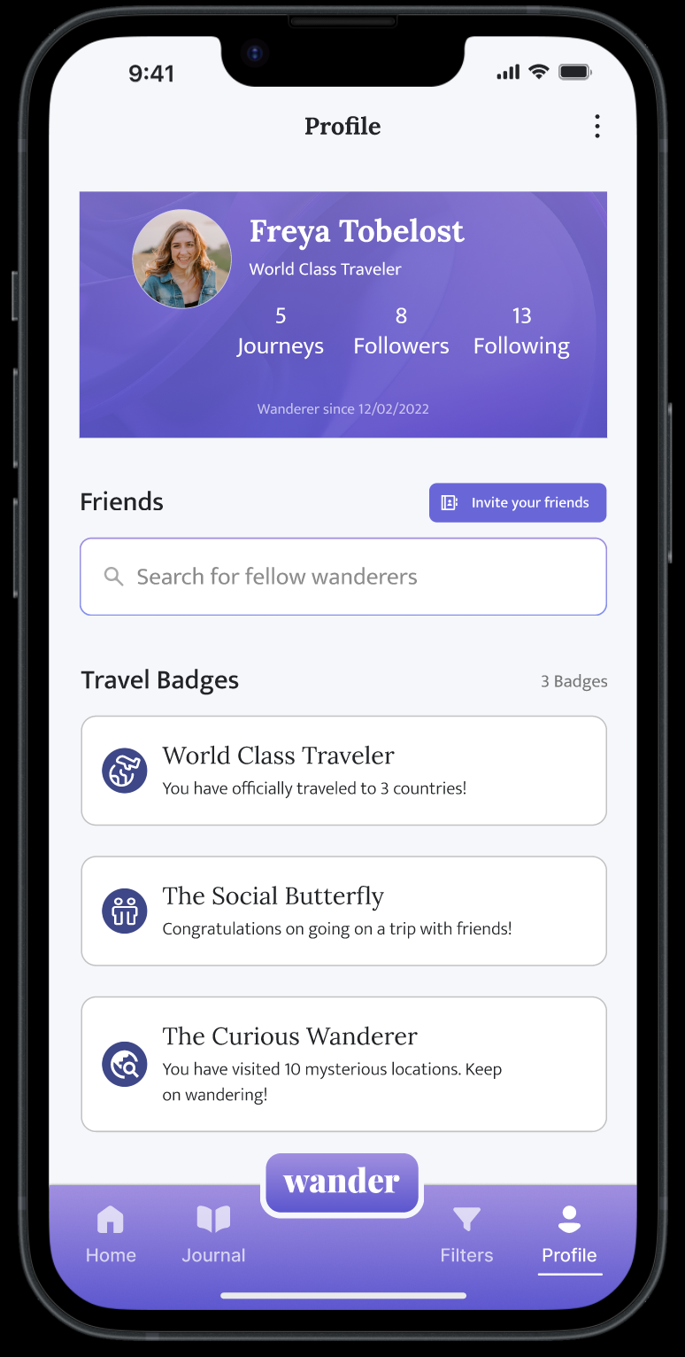
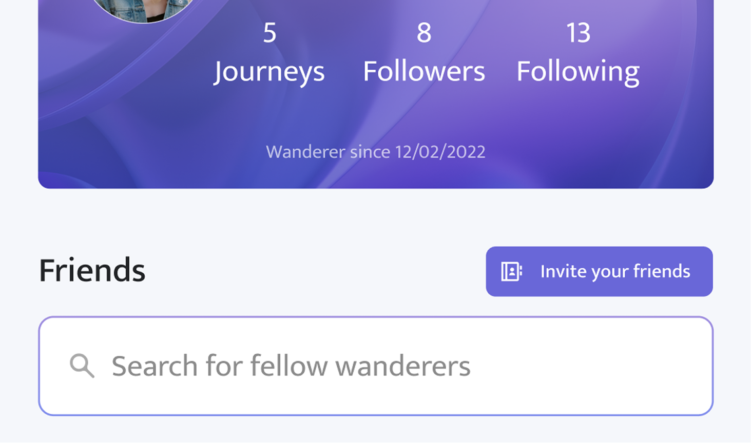
Profile

  • Users can follow their friends > creates a social aspect to provide a sense of community.

  • Earn travel badges, virtual rewards that users can unlock based on specific travel-related accomplishments.

  • Cultivates a sense of accomplishment/progression within the app, adding an element of gamification to users' travel experiences.

Measuring Impact
A plan to track data would allow us to measure impact and inform our next design decision

Tracking Engagement

To validate the Wander Button and, I’d measure click-throughs and adventure completions. A rising number of completions would suggest users are motivated to explore new places.

Tracking Retention

The Travel Journal feature also lends itself to tracking retention, since the number of documented adventures shows whether users return over time.

Measuring Happiness

The Invite Friends feature could be tied to referral rate — if users recommend Wander, it signals both trust and delight.

Satisfaction Rate

Measuring satisfaction in context is also important. A simple rating system at the end of an action + measuring click-through rate for the exit journey button can reveal user sentiment.
Wisdom learned

Never allow visual design to get in the way of the user

Visual design should support clear communication, intuitive navigation, andefficient task completion for the user. Gamifying an app needs to be done withextra caution because it can easily hinder the usability of a product.

User testing and feedback ensures the product doesn't stray from its purpose

Incorporating user testing and feedback as an iterative process helps maintain focus on meeting user needs and ensuring the product remains effective, user-centered and true to its purpose.
What I'd improve

Expand filters

Expand on location filters to include things like location distance, location price, user's diet restrictions. We'd need to also consider that places that require reservations don't get queued.

Continue user testing our map

Users might benefit from more map information, such as street names and name  of some surrounding buildings for measuring relative distance. User testing would provide more insights about whether a concealed map is truly the best option.

Flesh out microfunctionality in Travel Journal

Because of time, we weren't able to flesh out some interactions like deleting journals and specifying what journal to add a destination to once a Wander adventure is completed.

Psst, you've reached the end...how about another story?